Part 4 - Editing in Photoshop
In part 3 I prepared my image to be edited in Photoshop by merging the separate exposure layers into a single HDR image, Tone Mapping, and exporting a TIFF file that had a well adjusted tonal balance and a full range of tones. In this part I am going to begin the conversion to Black and White and perform my global and local adjustments.
 |
| Sheas Theater |
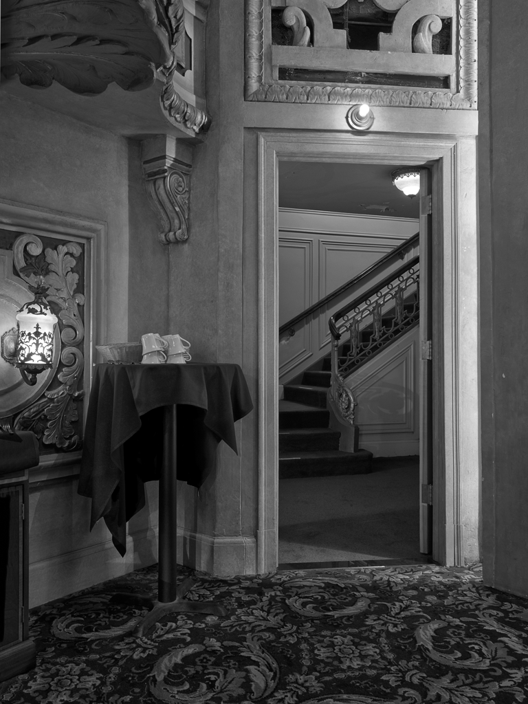
PhotoEngine did a great job of merging all the separate exposures into a single image. The resulting image has detail and separation through the entire tonal scale. I probably could have done the Black and White conversion right in PhotoEngine and had a pretty nice image but I knew that different areas of the image would need different treatment. So along with the global conversion to Black and White there would be a fair amount of local adjustment.
Instead of completeing the image in PhotoEngine I used it to Pre-Process my image. Pre-Processing is the step to produce a single image with a well balanced tonal range and detail throughout the entire image.
After loading the image into Photoshop my first task was to convert it to Black and White. I use different techniques depending on the image. I first tried a Black and White adjustment layer but didn't get the midtone separation that I wanted. So I tried another approach which often works very well. It's to use the Channel Mixer in conjunction with a Hue/Saturation layer.
I created a Channel Mixer adjustment layer and checked the box for monochrome. Then I created a Hue/Saturation adjustment layer below the Channel Mixer and above the background image. Now I have two methods of tuning the image. In the Channel Mixer I can use differing amounts of the Red, Green and Blue layers. Because this image is fairly monochromatic to begin with I really used these sliders to adjust the overall brightness of the image. The real magic took place in the Hue/Saturation layer.
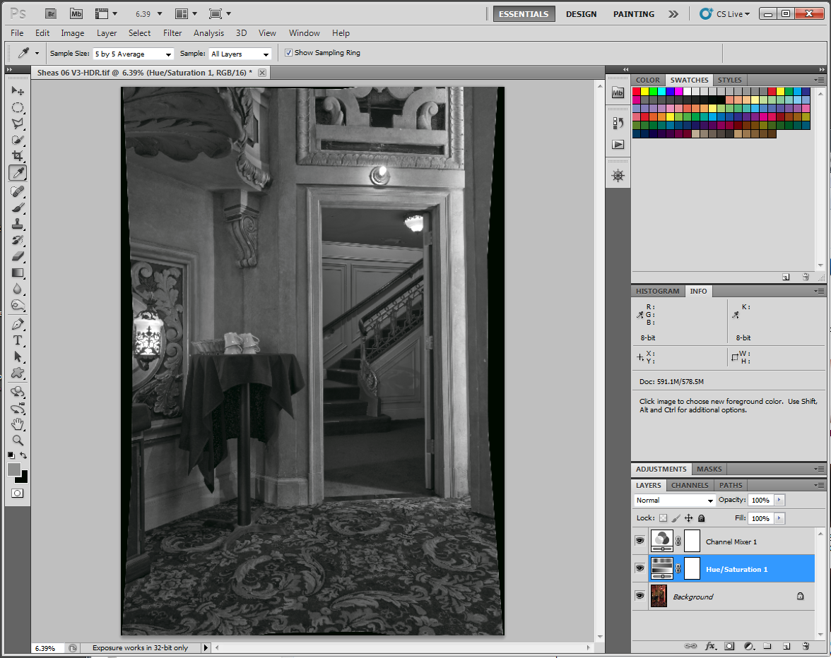 |
| Image with Channel Mixer and Hue/Saturation Adjustment layers |
Moving the Hue slider in the Hue/Saturation adjustment layer creates wild swings in the tonal relationships. I played around with this slider until I found a setting that gave me a pleasing effect. There is really no right or wrong here. My goal was to create as much separation in tones while keeping a pleasing overall balance to the image. In this step I was concerned with creating the best overall balance of separation and tone. Not worried about getting it right for all parts of the image.
If you turn off the Channel Mixer layer this is what the Hue/Saturation layer looks like.
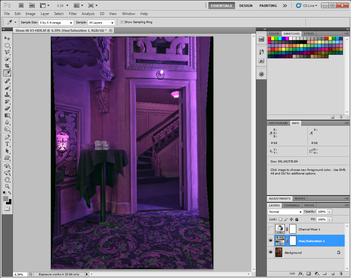 |
| Effects of the Hue/Saturation Layer |
A Layered Approach
One of the wonderful things about Photoshop is that you can use many different approaches to achieve your results. Often I will use adjustment layers to modify different parts of the image but in this case I decided to work a bit differently. Sometimes I find the most effective way to work is to use global adjustments to tweak a local part of the image. When doing this I pay attention to only the area I am adjusting for and forget how the other areas of the image appear. Once I have the area of interest looking correct I will create a new layer which incorporates those adjustments and mask. That's how I decided to work with this image.
After getting a pleasing balance with the Channel Mixer and Hue/Saturation layers I created a new layer merging all the adjustements. This is easily done by selecting the top most layer and pressing Ctrl-Alt-Shift-E on my PC. This creates a new layer above all the others merging the adjustments. I renamed this layer to "Overall Tonality". It now becomes my base image. But I didn't delete the layers below. I kept the background layer because that is my source. I will continue to creat new layers adjusting them for the enhancments I want to make to local areas, copy those to new layers, then mask the adjusted areas.
By the Numbers
One of the things I learned very early on is to work by the numbers. I have a calibrated monitor but it's very easy to stray from accurate tones when you are relying on what you see on screen and not checking the actual values. Images on screen can look very different when printed and my goal is to produce prints. Mmy printer is capable of holding very accurate tonal values. Because of this I closely watch the values I place tones on. I have printed step wedge sitting here on my desk that I refer to when I'm not sure how a value will print. For example; shadow values can look muddy and appear to blend together but looking at my printed gray scale targets I can see that my printer will be able to separate the values quite easily.
At the other end of the scale is how highlights will print. I know that my printer is capable of separtating values right down to 1%. So even though I chose to place parts of the image at 5% I can be confident that I will see a tonal difference between 5% and 3%. I highly recommend that you print a step wedge on your printer and keep it by your computer as a reference. This way you will know if you can comfortably hold separtion between values anywhere along the tonal scale.
The next area I wanted to correct was the lamp on the left isde of the image. I wanted this lamp to be as bright as possible while maintaining some of the subtle gradations that give it character. Zooming in on that part of the image I can see that there is a part of the lamp that really has no tonal detail and a part of the lamp that does. I set two sample points one on the area that I felt could go completely white (point 2) and another on the brightest part of the lamp that I wanted to retain detail (point 1) I wanted to make sure that point 1 did not ever get over 5%.
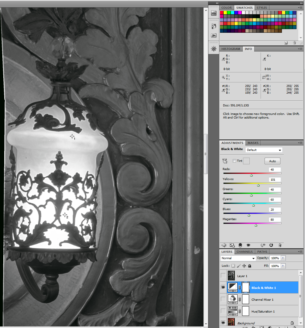 |
| Lamp with Sample points to watch. |
To make this adjustment I added a Black and White adjustment layer. Moving the red and yellow sliders until I pushed sample point 2 to 255 (0%) and sample point 1 to 242 (5%)
I created a merged layer again by pressing Ctrl-Alt-Shift-E. To this layer I added a 100% black mask. I switched to the paint brush and painted over the mask with white to expose the adjusted parts of the lamp.
The next critical part of the image is the door frame particularly on the right side where it is illuminated directly by lights recessed in the wall. This part of the image needs to be pushed up to higher luminances to keep the image balanced without loosing the tonal detail. I placed a sample point on what looked like the brightes part of the area where I wanted to preserve this detail. It's important for this area to have a high value but not exceed the values I set for the lamps. That just wouldn't look right. For this part of the image I went back to my Channel Mixer and Hue/Sat layers and adjusted the red and green sliders till I had a value on this point of 233 (9%.)
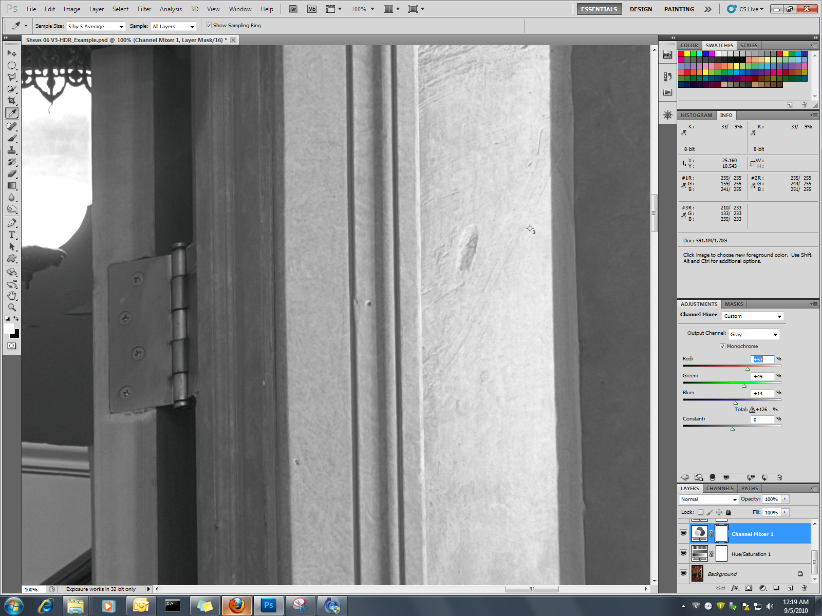 |
| Adjusting the Channel Mixer and Hue/Sat layers for the door frame |
A new merged layer containing these adjustments was made using Ctrl-Alt_Shift-E and that layer placed at the top. I added a black mask and painted in white over the door frame on the right. I also dropped my opacity to 30% on the brush and painted over some of the ligher areas of the wall near the lamp on the left side of the image and the light bulb above the door frame. This brightened up those areas nicely without blowing them out.
I felt the carpet could also use some work. I wanted to darken it overall and increase the separation in the pattern. I used the same method of adjusting the black and white sliders then merged the result to a new layer.
Here's how the image is starting to shape up.
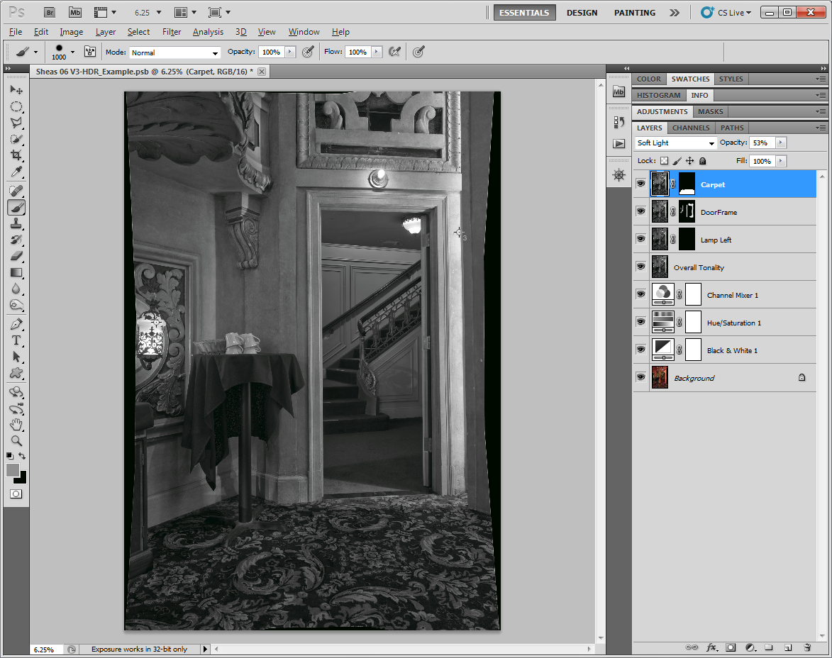 |
| Multiple layers adjusted and masked for local areas |
Keep in mind that the layers below "Overall Tonality" are not visible. The "Overall Tonality" layer is my base layer and has 100% opacity. Everything below it is being used to create new layers with unique adjustments for local areas.
If I keep making adjustments with this approach I will soon have an image that contains far too many layers and will be way too big to save and work on (remember that each layer is roughly 90 megapixels.) This is starting to look pretty nice to me and I feel good about the adjustments I have made so far. To keep these adjustments and reduce the size of the file I merged the top four layers into a single layer and renamed it "Master"
I still felt that the hallway is too dark. I didn't want to brighten it up too much because it will start to interfere with the balance of the foreground. So turning off the Master layer I make my adjustments to brighten up the hallway and give it some separation.
Notice that the rest of the image goes way too light. Not a problem. I'm going to merge these adjustments into a new layer and mask for the hallway in the same manner as the previous adjustments. Once the layer and mask are created I can use the opacity slider to fine tune the tonality.
|